






Image saturation

Upload a photo, describe the color intensity and areas to protect, then develop a controlled saturation edit in Ottermind Studio.

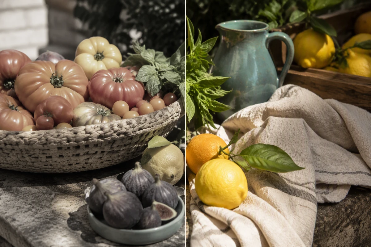
The same market still life appears muted on the left and naturally richer in color on the right.
Claude
GitHub
Google
Linear
Microsoft
Monday
Netlify
Notion
OpenAI
Sentry
Slack
Stripe
Supabase
Claude
GitHub
Google
Linear
Microsoft
Monday
Netlify
Notion
OpenAI
Sentry
Slack
Stripe
Supabase

Make Image Saturation Serve the Subject

Image saturation controls the intensity of color across a picture. Raise it when a photo feels flat; lower it for a quieter palette. Before editing, name the subject, desired mood, and colors that must remain natural. For a broader stylized transformation, explore Image Effects as a separate task.

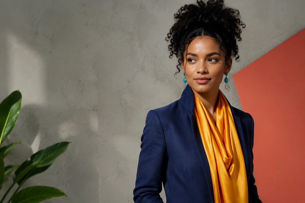
An editorial portrait with vivid clothing and background accents while skin tones remain natural.

Protect Skin While Colors Pop

Saturation changes can push faces toward orange or red before the scene looks lively. Request a restrained global adjustment and protect skin and already-strong accents. Use Fix Blurry Pictures separately when softness is the problem, rather than asking color to carry detail.
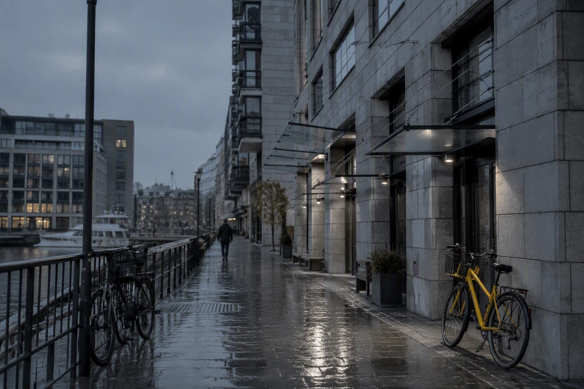
A desaturated waterfront street retains architectural detail and one restrained yellow bicycle accent.

Choose Global or Selective Color

Use global image saturation when the whole frame needs one direction. If only a product, garment, or background hue feels weak, name that target and preserve everything else. Use AI image generation when you need a new composition rather than measured color correction.

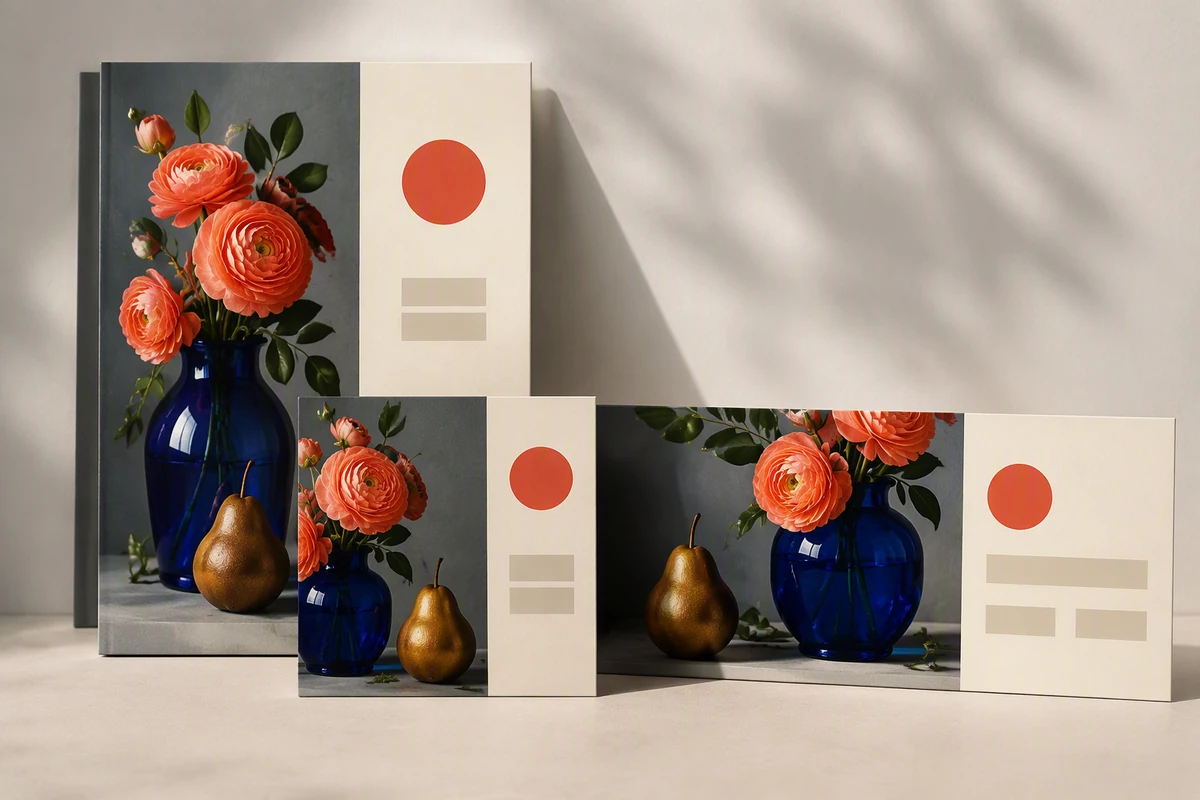
Coordinated poster, social card, and banner mockups use one consistent saturated floral still life.

Review Color in Its Destination

A saturation edit can read differently at thumbnail size, beside typography, or across a campaign set. Compare the treatment in its final layout before committing. Build arrangements with the Free Online Photo Collage Maker, then extend approved direction with the AI Social Media Post Generator.

How to Adjust Image Saturation with Control

Step 01

Set the Target

Upload the strongest available source and state whether you want richer color, muted color, or a selective correction. Name the subject and intended use.

Step 02

Protect Key Colors

Describe skin tones, neutral whites, brand colors, or already vivid areas that should not shift. Ask for one restrained option before a stronger variation.

Step 03

Check Before Finishing

Compare the result with the source at full size and thumbnail size. Stop when skin, neutrals, gradients, and important details still look believable.

Why creators choose Ottermind

Context Stays Attached

Your source, target mood, protected colors, and review notes can remain organized around the same project.

Visual Work Continues

Carry a reviewed saturation edit into posters, campaign assets, or later creative steps without rebuilding its direction.

Focused Iteration

Ask agents to revise color intensity while keeping the subject, layout, and approved visual decisions in view.

Separate Sharpness Problems

Use Fix Blurry Pictures when softness is the real issue, keeping saturation decisions focused on color.

Cross-Device Progress

Start on one device, continue on desktop, and let longer creative work run in the cloud.

Visible Review

Inspect agent work and approve critical connected-tool actions instead of treating the first saturation result as final.

FAQ

What Does Image Saturation Change?

Image saturation changes the intensity of colors. Increasing it makes hues appear stronger; reducing it moves them toward gray. It does not replace decisions about exposure, contrast, hue, or white balance, so name those separately when the real problem mixes color and tone.

How Much Saturation Should I Add?

There is no universal value for every photo. Begin with a restrained saturation adjustment, compare it with the source, and inspect skin, neutral objects, strong reds, and smooth gradients. Stop when the subject reads clearly without color becoming the distraction.

When Should I Reduce Saturation?

Reduce saturation when competing colors overpower the subject, the intended mood is quiet, or already vivid areas feel artificial. Preserve tonal separation as color recedes. A desaturated image should still retain readable highlights, shadows, textures, and a deliberate focal point.

What Is Saturation versus Vibrance?

Saturation broadly changes the intensity of all colors. Vibrance typically emphasizes less-saturated colors and protects already strong colors or skin tones, although implementations vary. For portraits, ask for restrained color intensity and explicitly identify skin as an area to protect.

Can I Target One Color or Area?

Describe the exact object, hue, or region that needs adjustment and list everything that should remain unchanged. Add a reference when color accuracy matters, then inspect edges and nearby reflections. Keep broad image saturation unchanged when a selective correction solves the problem.

What Comes after the Saturation Edit?

Review the result in its final crop and layout before reusing it. If the still will become motion content, continue with Image to Video while keeping the approved palette, subject identity, and protected-color notes attached to the project.

Discover more

What they say about Ottermind

I uploaded my lecture notes before an exam and asked for a simple study guide. It pulled the main ideas together and gave me a much clearer place to start reviewing.

Jamie Lee - University Student

More from the blog

Start a Controlled Saturation Edit

Bring your source image, target mood, protected colors, and intended placement into Studio, then compare a restrained result before committing to stronger color.

Adjust Image Saturation